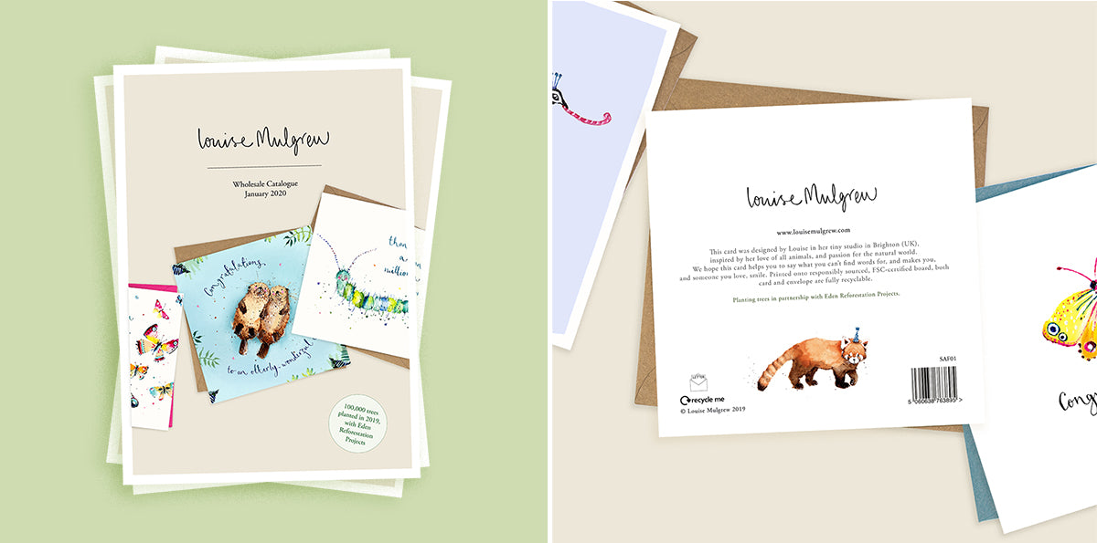
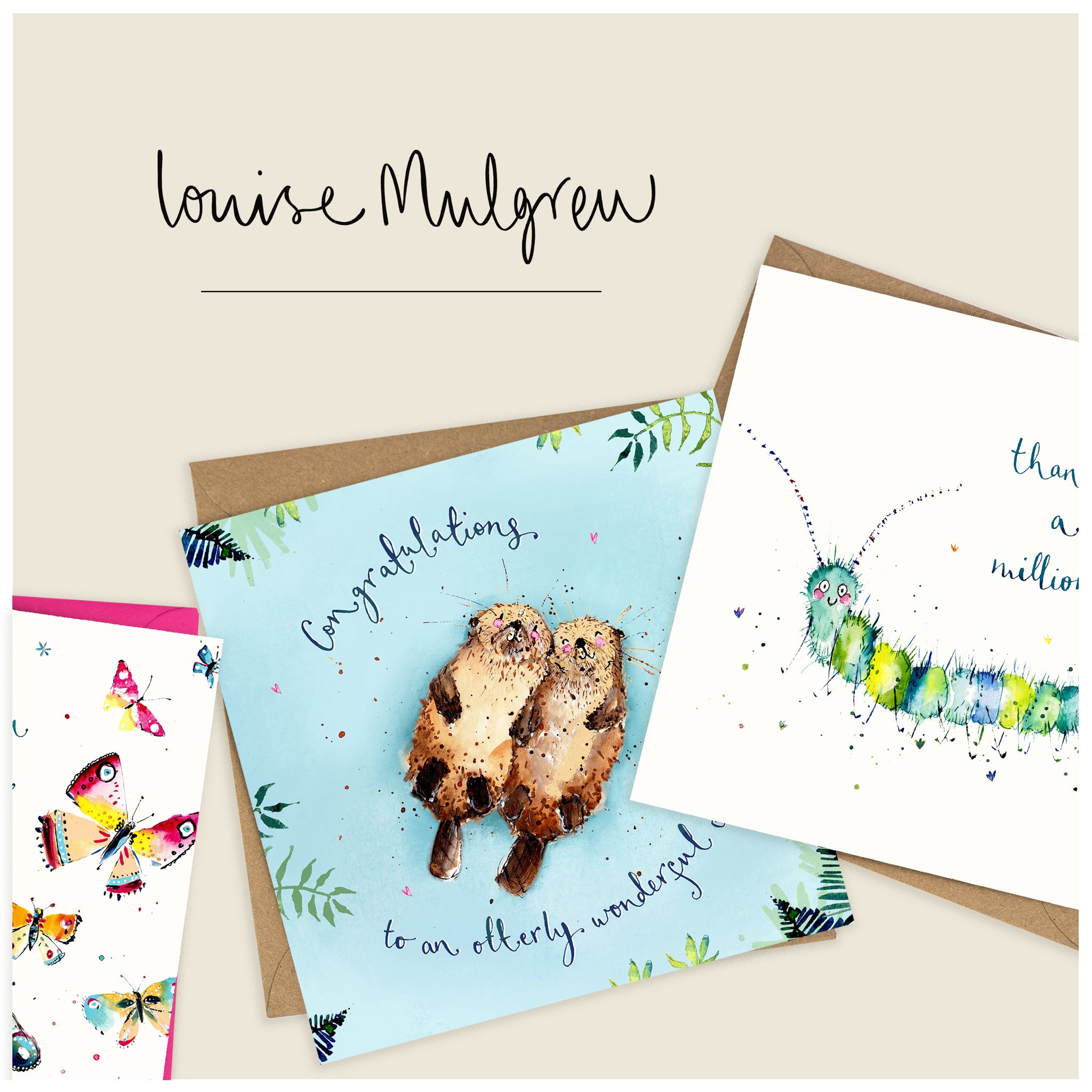
Four years in, and I decided it was time for a bit of a brand facelift! When I first set up Louise Mulgrew Designs, I gave literally one second of thought to our name and logo and approximately no thoughts whatsoever to things like brand colour palettes, brand values, a strap line etc… I haven’t particularly worried about this because I hope it’s been the case that our ethos and personality has shone through where it matters most: in the card designs.
Well, I finally feel it’s time to freshen up our whole look, and the place I started was the company name: Louise Mulgrew Designs. A bit of a mouthful: I’ve always felt it’s too long and difficult to say. Louise Mulgrew is a silly name at the best of times, and adding Designs on the end was unnecessarily fluffy. I thought long and hard about moving away from using my own name completely, but I couldn’t think of anything I liked better and they are my drawings after all… so I’ve settled on the even more egotistical: ‘Louise Mulgrew.’ (Dad insists that I note here that technically we are Louise Mulgrew Designs Limited trading as Louise Mulgrew)…. catchy 🙂

Next up, our new logo. It’s super simple and I love that. Our original logo was my handwriting four years ago, and it matched the handwritten typeface I did on our first designs. Unless you know what it says though, it’s probably quite difficult to read and I never found it easy to apply to other marketing and packaging materials. Over the years my writing has evolved to be a little less curly and wobbly, but it’s still a recognisable part of our card designs. I wanted the new logo to be handwritten too, maintaining a traditional, analogue feel that’s in keeping with my illustration style, but just a little more legible and a little less busy. I wrote my name out a hundred times (I felt like I was back in my high school maths class… although writing my own surname rather than the surname of the boy I fancied at the time) and this version was the one that made the final cut:

The most complicated part of the rebrand process, as a product-based business, will be managing the phasing in of the new logo on the backs of our cards: we print in large quantities and hold a lot of stock in our warehouse. All print runs moving forward will have our new logo on the back, but we will be running down stock with the old logo first. If you’re a stockist of ours, you may find your orders contain some cards with our old logo for a little while… but I’m afraid we ain’t gonna waste ’em 🙂 I don’t think any of the card-buying public will mind too much, they’re a nice bunch!

As for a company strap line… we still don’t have one of those, we’re not quite that slick. What I hope happens when people come across our cards is that they feel something, perhaps that the illustration reminds them of someone or they see themselves and a friend or partner in the animal characters, that the drawings make them feel connected or happy or moved in someway. The cards are obviously animal and nature inspired, but they rely on people drawing parallels between animal and human behaviours and relationships and are ultimately a celebration of these things. My best effort at consolidating these ramblings into a website intro is this: 'We hope our illustrations help you to say what you can’t find words for, capture your special relationships and make you, and those you love, smile.'

Our website has had a bit of a freshen up too and we even have an official brand colour palette (effectively every colour of the rainbow so probably unnecessary). I’m not sure where these will get used, but they already feature frequently in our designs and feel very ‘us’ 🙂

Thanks for reading if you got this far… visit our About page to read more of our story, our values and to meet the team, our Sustainability page for a thorough understanding of what we’re doing to reduce our impact on the planet, which is an absolute priority for us, and our Giving page to learn about our corporate partnerships with two very worthy causes.

